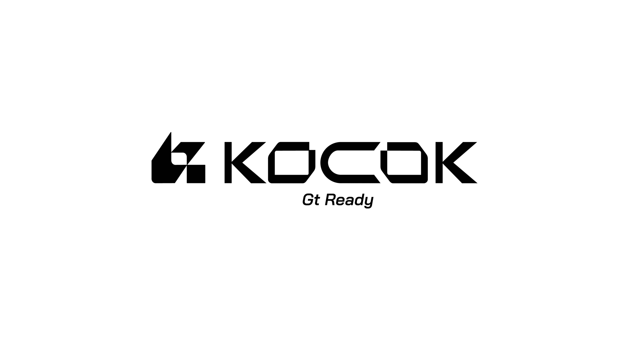
Kocok
logo商標設計
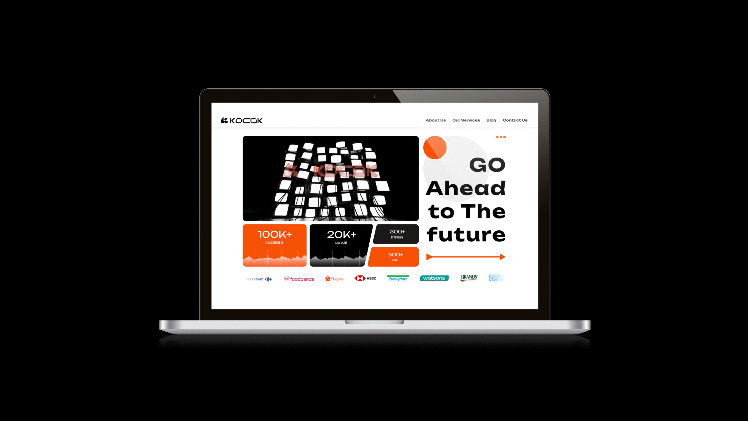
KOCOK 提供專業的品牌推廣、網紅營銷和廣告服務,幫助企業提升品牌知名度與銷售業績。服務內容包括 KOL 合作、社交媒體行銷與影響者行銷策略。
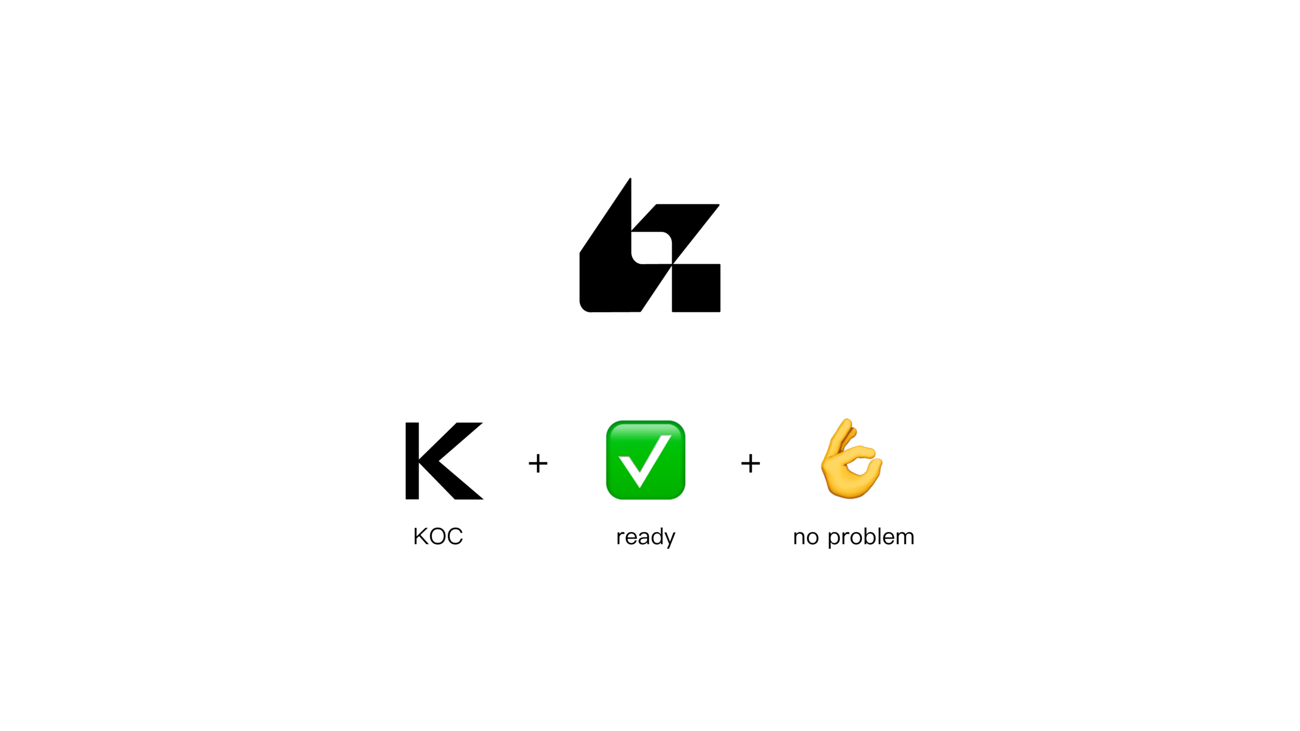
品牌為「準備好要紅」的創作者而生,Logo 整體造型融合三個核心意象:來自 KOC 的「K」形象;「打勾符號」轉化為幾何語彙,代表創作者已準備就緒,Ready to go;而「OK 手勢」則象徵「我沒問題、我可以」的自信態度。
整體視覺風格以年輕、潮流為定調,呼應新世代創作者的語境與節奏。
KOCOK provides professional brand promotion, influencer marketing, and advertising services to help businesses increase brand awareness and boost sales. Services include KOL collaborations, social media marketing, and influencer strategy development.
The brand is built for creators who are “ready to shine.” The logo design blends three core ideas: the “K” shape inspired by KOC; the check mark transformed into a geometric symbol, representing creators who are ready to go; and the OK hand gesture, expressing confidence with a clear message — “No problem, I got this.”
The overall visual identity is defined by a youthful and trendy aesthetic, resonating with the language and rhythm of the new generation of creators.
desigNer / jungo